Arthouse Webpage (Case Study)
A web-based version of the Arthouse app
Roles:
UX Research (performed during app design)
Information Architecture
Wireframing
Low- and High-Fidelity Prototyping
Tools:
Figma
Paper Wireframes
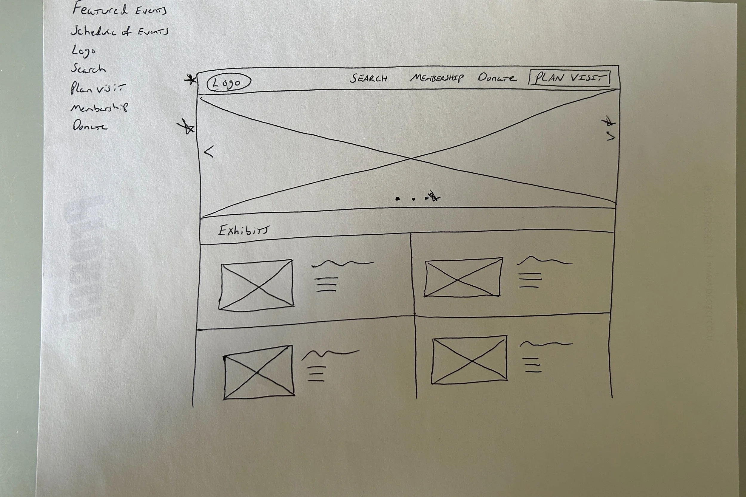
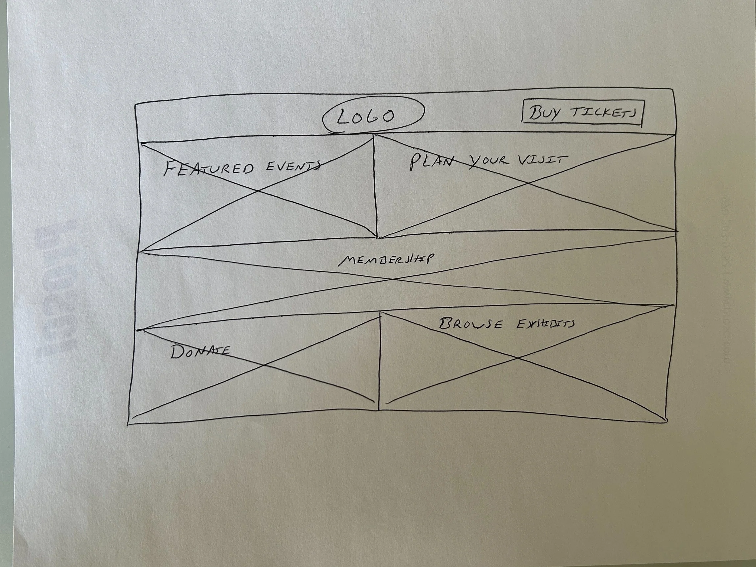
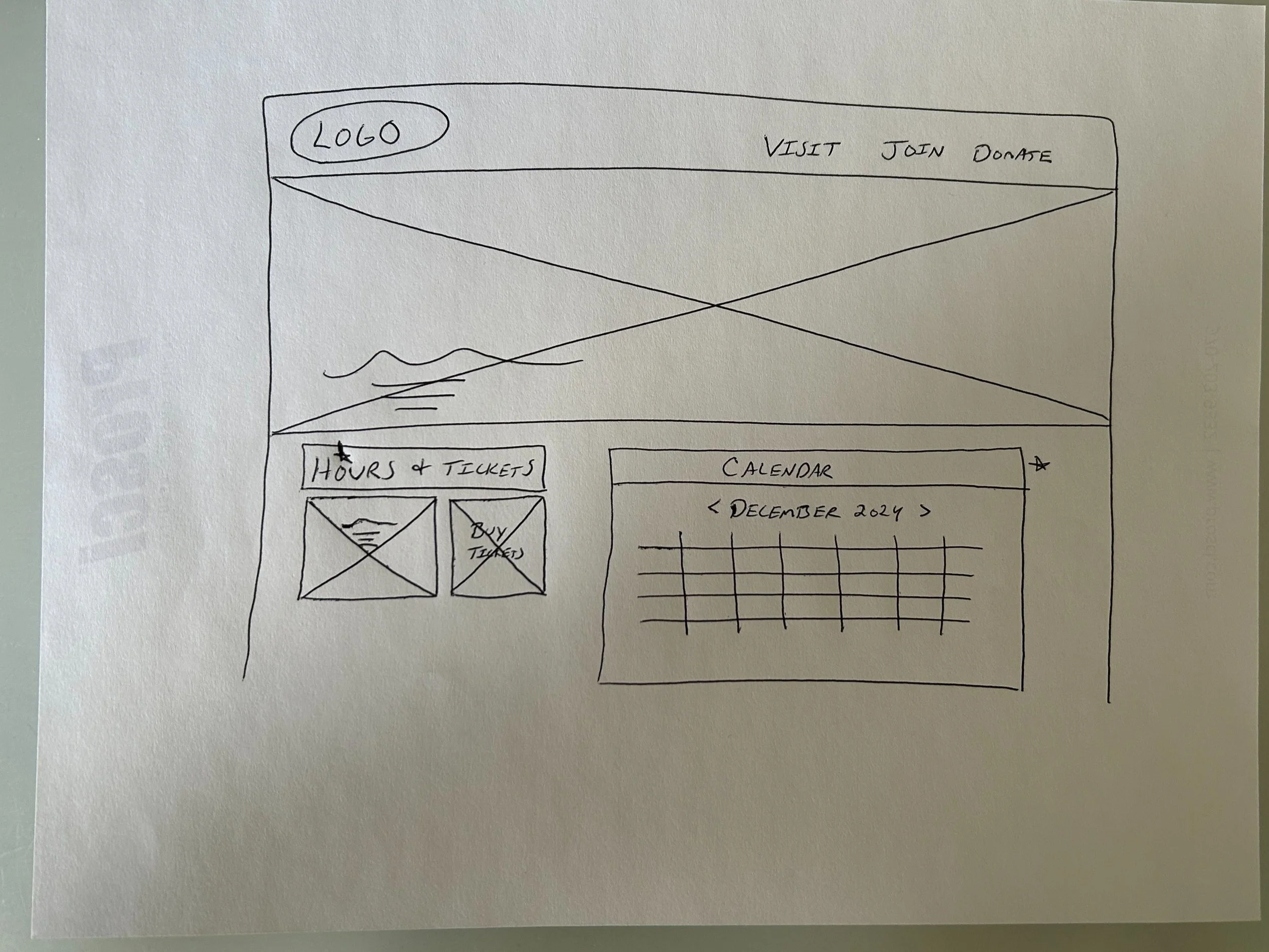
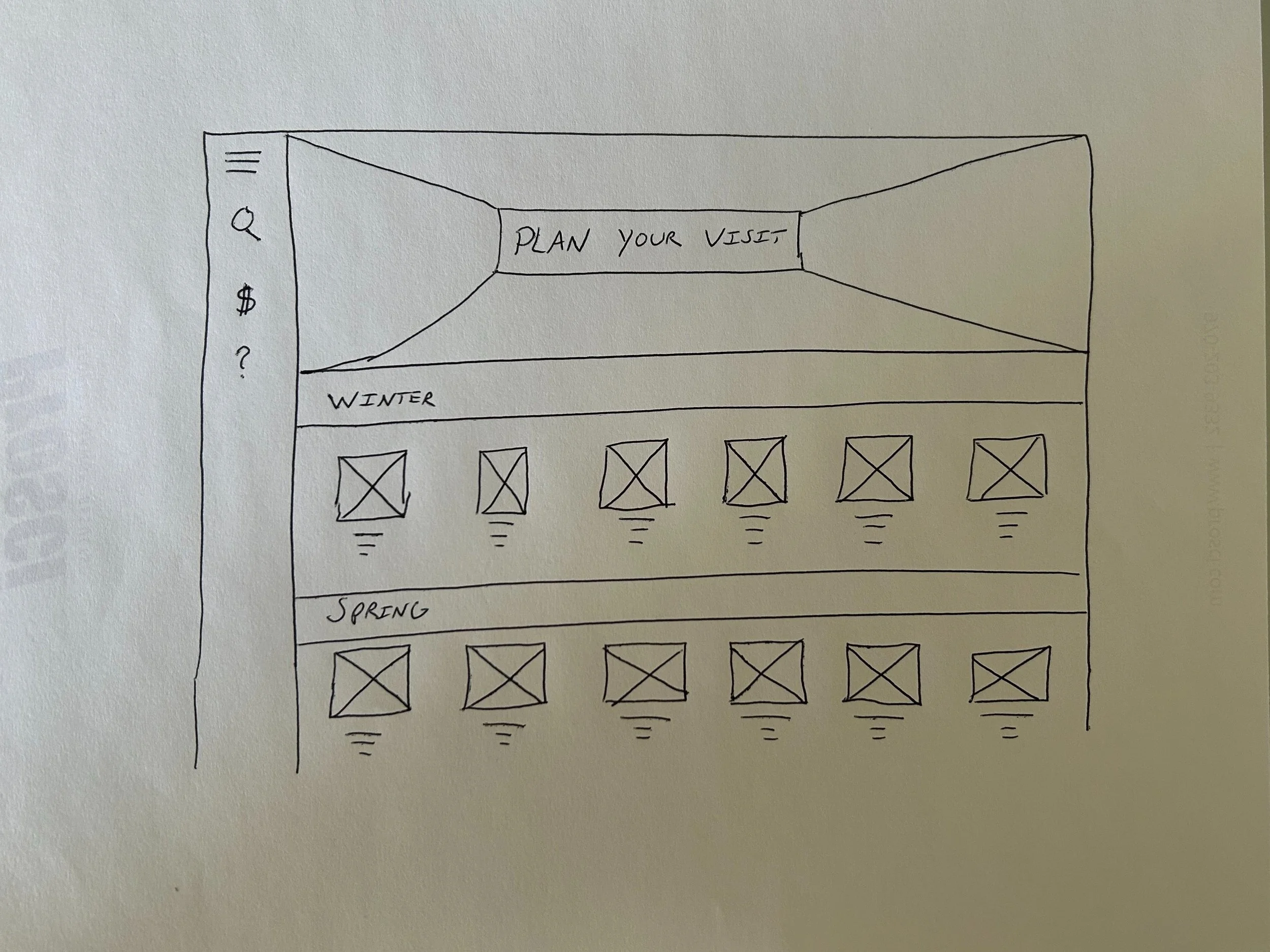
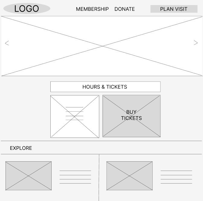
During paper wireframing of the homepage, I came up with different configurations to make the most of the available space for museum exhibit advertisements. Ultimately, I opted for using more negative space and bringing the hours and tickets information forward, since that is what users are looking for in addition to exhibit information.
Digital Wireframes
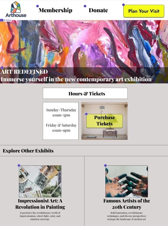
For the web homepage, I kept museum information and a featured events carousel above the fold, since this is the main information users are looking for.
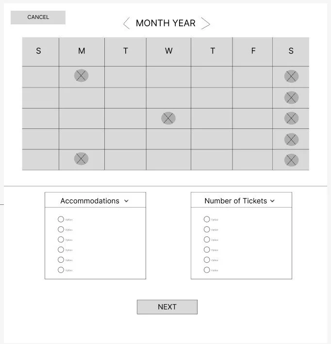
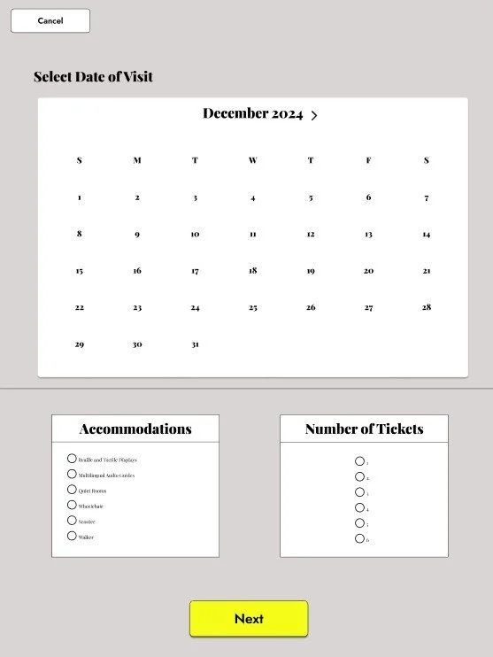
For the scheduling page, I chose a calendar to simplify the date selection process. I also included available museum accommodations front and center so that users may easily reserve them prior to the visit
Low-Fidelity Prototype
Low-Fidelity to Mockup Examples
High-Fidelity Prototype
Takeaways
The museum website project was an extension of the initial app work. I had never done a progressive enhancement design and found it interesting considering the larger space of a webpage versus a mobile application. While the work I had done on the application helped with the webpage—font, color scheme, general layout, etc.—I found it challenging to balance the information on the scale of a webpage. I wanted to make best use of the available area, but still hold back slightly to allow for negative space. The webpage also allowed me to experiment with interactive calendars and carousels, which I had never done before in Figma.
Contact Me
Interested in working together? Fill out the form and I will be in touch shortly. I can’t wait to hear from you!
